Creating a good homepage comes down to one thing: showing visitors within a few seconds that they're in the right place, and then guiding them to the next step. What do you do, for whom, and what should the visitor do now? If your homepage answers those three questions quickly, you're in good shape.
In this article you'll learn which sections belong on a homepage, in what order, and which mistakes to avoid. With a checklist you can apply to your own site straight away.
What is the purpose of a homepage?
Your homepage is often the first page people see, especially when they google your business name. But it's not the place to tell everything. Think of it more as a reception desk: you welcome people, show what you do and point them the right way.
A visitor who already knows what they want should be able to click through quickly to the right service or to contact. A visitor who's still unsure needs enough trust to keep reading. A good homepage serves both.
What should be on a homepage?
Almost every strong homepage for a small or growing business contains these sections:
- A clear headline that says what you do and for whom. Not a slogan, but a sentence a stranger understands immediately.
- A short explanation of one or two sentences about the result the customer gets.
- A clear main button, such as "Request a quote", "Book an appointment" or "Order now".
- An overview of your services or products, with a link to each page.
- Proof: reviews, client logos or examples of your work.
- A short explanation of how it works, for example in three or four steps.
- Something personal: who's behind it? A photo and a few sentences work well.
- Contact details and, where relevant, your service area or address.
Good homepage layout, from top to bottom
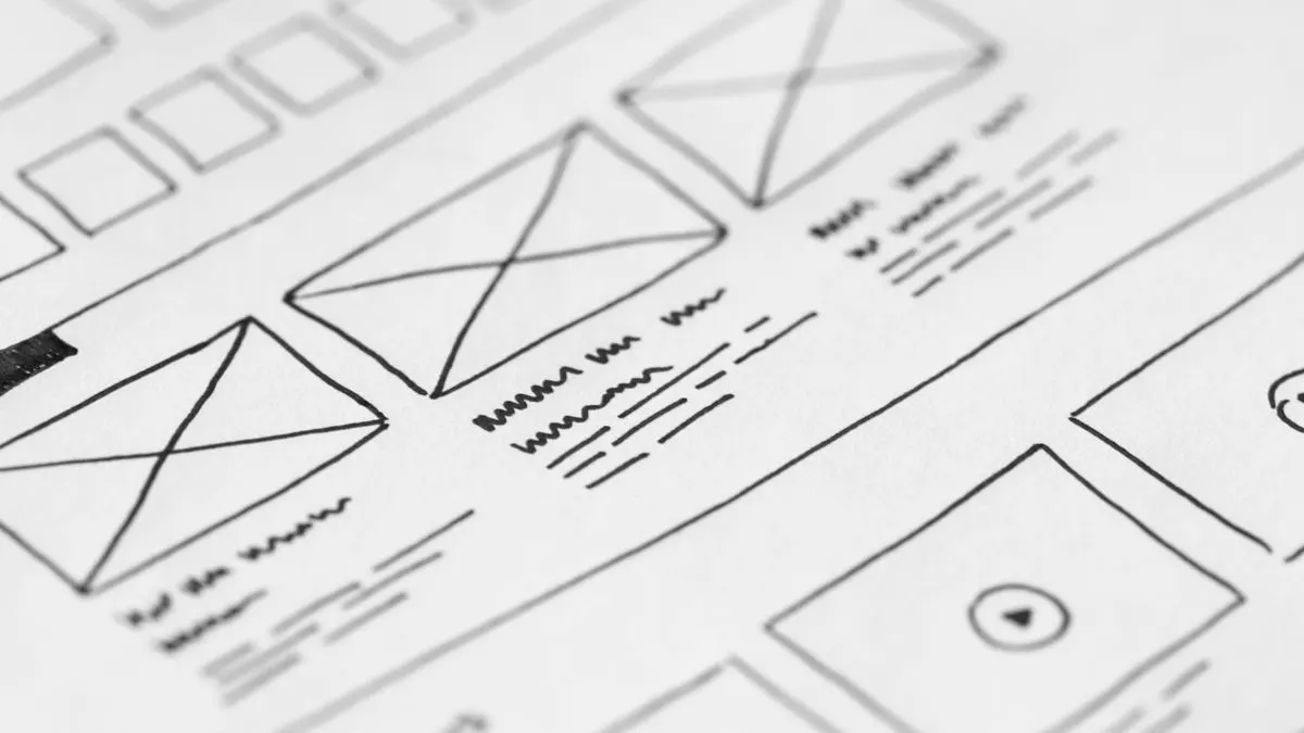
The order matters as much as the content. A layout that works for many businesses:
- At the top: headline, short explanation, main button and a strong photo. Visitors see this part without scrolling.
- Directly below: proof, such as a review score or a few client logos.
- Then: your services, each with a short sentence and a link.
- Next: how it works, to lower the barrier to getting in touch.
- After that: examples of work or featured projects.
- Then: frequently asked questions that remove doubts.
- At the bottom: the main button again and your contact details.
You don't have to copy this literally. But every section needs a reason. For each block, ask yourself: does this help the visitor make a decision?
How to write a strong headline and copy for your homepage
The headline is the most important piece of text on your whole site. Yet it's often the vaguest. "Welcome to our website" or "Quality and service" tells a visitor nothing.
A good headline is concrete. Compare "Your partner in mobility" with "Driving lessons in Den Helder, with a trial lesson you can request in 30 seconds". The second tells you straight away what you get and where. Write from the customer's side: what problem do you solve, and what does it deliver?
Keep the rest of the copy short and scannable. Use subheadings, short paragraphs and lists. You'll find more tips on writing for the web in writing website copy.
Common homepage mistakes
- A slider with rotating images and messages. Visitors usually only see the first one, and it slows the page down.
- Too many buttons that all look equally important. Choose one main action.
- Only talking about yourself: "we are", "we do". Talk about what the customer gets.
- No proof. Without reviews or examples, visitors have to take your word for it.
- A long block of text at the top that nobody reads.
- A homepage that's messy on mobile, with buttons that are too small or text that runs off the screen.
- Contact details you have to hunt for.
Mobile deserves extra attention. Many visitors first see your homepage on their phone. So also read our article on a responsive website.
Your homepage and being found on Google
Your homepage usually ranks for your business name and a few broad search terms. For specific services, separate service pages work better. So don't try to make your homepage rank for everything. Do make sure you have these basics:
- A page title and meta description that say what you do and where, for example "Plumber in Haarlem and surrounding area".
- One main heading (the H1) that matches that title.
- Clear links to your service pages, so Google and visitors find them easily.
- Your name, address and phone number, especially if you work locally.
- A fast load time, especially for the large image at the top.
Checklist: is your homepage good?
Have someone who doesn't know your business look at your homepage for five seconds. Then ask:
- What does this business do?
- Who is it for?
- What would you do now if you were interested?
- Why would you trust this business?
If that person can't answer all four, you know where to start. Also check whether the page loads quickly, whether the main button is clearly visible everywhere and whether your contact form is easy to use. If you want more visitors to click through and get in touch, also read increasing website conversion.
Getting a good homepage built
At Violexa every website project starts with the homepage. We first decide together what visitors should do, and build the page around that. A few examples from our work:
- Rijschool Benz in Den Helder: a homepage where you request a trial lesson in 30 seconds, with lesson packages and a price comparison with other driving schools in town.
- WitFix, appliance repair across the Netherlands: a service finder by appliance and town, Google reviews on the site and a quote form.
See more projects in our work. A custom website starts from €1,799 excl. VAT (€2,177 incl. VAT) per project, including design, build, the SEO basics, Google Analytics, CMS integration and a walkthrough. Read more under websites and apps.
Want to know how your homepage could be better? Book a free quickscan. In 30 minutes, online or on site, we look at your site together. Afterwards you get short written advice with a price indication, with no obligation.
Frequently asked questions
How long should a homepage be?
As long as it takes to win a visitor over, and no longer. For most businesses that's a headline with a main button, services, proof, how you work and contact. Every block should help the visitor make a choice.
What goes at the top of a homepage?
A clear headline that says what you do and for whom, a short explanation and one clear button. Add a fitting photo. This part should be visible without scrolling.
Is a slider on the homepage a good idea?
Usually not. Visitors often only see the first image, and a slider makes the page heavier. One strong headline with one message almost always works better.
How do I create a good homepage for a small business?
Start with what a visitor should do, such as call, book or request a quote. Build the page around that with a clear headline, your services, reviews and contact. Test the result with someone who doesn't know your business.