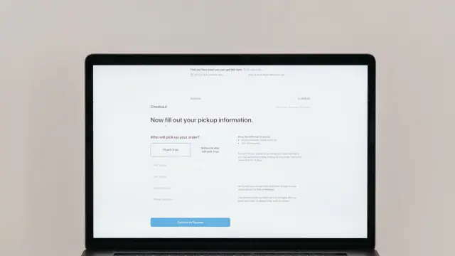
Knowing how to create a landing page pays off when you want visitors to do one thing: request a quote, book an appointment or sign up. A landing page is a standalone page where people 'land', often from an ad, a mailing or a social post. Everything on that page revolves around one goal.
A good landing page is focused, short where possible and clear about the next step. Below you will learn how to build one, which elements belong on it and how to improve it step by step.
What exactly is a landing page?
A normal page on your site often has several goals. Your homepage, for example, shows all your services, your story and your contact details. A landing page deliberately doesn't. It has one offer, one audience and one action.
That is why you often leave out the main menu on a landing page, or make it smaller. Every extra link is an exit. The less distraction, the greater the chance someone does what they came for.
A landing page doesn't have to be separate from your website. Often it is simply a page within your own site, with your own branding and domain name. That builds more trust than a page on an unfamiliar address from an external tool. Plus, such a page can also be found in Google, if it has its own topic and is well written.
When do you need a landing page?
- With Google Ads or social ads: the page must match exactly what the ad says.
- For a promotion or new offer: for example a seasonal discount or a new service.
- For local search visibility: a page per service and location, as WitFix does with pages per service area.
- For a download or sign-up: a checklist, e-book or webinar in exchange for an email address.
- For an email campaign: so the reader doesn't have to search your homepage for what they read in the email.
How to structure a good landing page
A landing page that works usually has these elements, in roughly this order:
- A headline that names the problem or the promise in your customer's words. Not a slogan, but a clear sentence.
- A short subheading explaining what you offer and for whom.
- One clear button at the top, such as 'Request a quote' or 'Book a trial lesson'.
- Three to five benefits in a list. Write what the customer gets out of it, not just what you do.
- Proof: real reviews, client logos or examples of work.
- An explanation of how it works, for example in three or four steps.
- Answers to doubts: price, delivery time, guarantee, what happens after the enquiry.
- The button repeated at the bottom of the page.
See examples on our work page.
Writing landing page copy that persuades
The copy makes the difference. A few rules of thumb:
- Start with your customer's question, not your business. 'Your washing machine working again tomorrow' works better than 'We have been specialists for years'.
- Write short. Short sentences, short paragraphs, plenty of white space.
- Use the words from your ad or keyword in your headline too. Then visitors immediately feel they are in the right place.
- Be specific. Mention prices, times and steps instead of vague promises.
- One action per page. If you are torn between 'call' and 'form', pick one as the main button.
You'll find more tips on writing for the web in our article on writing website copy.
Landing pages for Google Ads
With ads you pay per click. So a poor landing page costs you money directly. Google also looks at 'landing page experience' when determining your Quality Score. A better score can lower your cost per click.
So pay attention to three things. The page matches the content of the ad. It loads quickly, even on a mobile connection. And it is easy to use on a phone. Read more about Google Ads for SMEs.
Optimising your landing page
A landing page is never perfect in one go. So measure what happens. Set up a conversion in Google Analytics for the form or the button. Then you can see how many visitors actually take action.
Then improve step by step. Change one thing at a time, such as the headline, the button text or the length of the form. That way you know what made the difference. With few visitors it takes longer to see anything reliable, so be patient.
Things that are often worth testing:
- The headline: a promise ('Your new kitchen within a week') versus a question ('Looking for a kitchen fitter near you?').
- The button text: 'Submit' says little. 'Get my quote' says what the visitor will receive.
- The number of fields in the form.
- Where reviews sit: higher up the page or right next to the button.
- A photo of yourself or your team versus a generic stock photo.
Also look at what visitors do before they drop off. Do they not scroll past the headline? Then that headline probably doesn't match what they expected. Do they start the form but not submit it? Then the form is too long or asks for something they don't want to give yet, such as a phone number.
Common landing page mistakes
- Sending visitors from an ad to your homepage.
- Too many choices: five buttons, a full menu and links to your blog.
- A form with ten fields when you need three. Also read our tips for a contact form that converts.
- Large images that slow the page down.
- No proof: no reviews, no examples, no face.
- Not measuring, and so not knowing whether the page works.
Help with creating a landing page
At Violexa we build landing pages as part of online marketing, together with SEO, Google Ads and social media. Online marketing starts from €599 excl. VAT (€725 incl. VAT) per month, with no minimum term and cancellable monthly with one month's notice.
Want to know which landing page would deliver the most for your business? Book a free quickscan. It is a 30-minute conversation, online or in person. Afterwards you get short written advice with a price indication, with no obligation.
Frequently asked questions
What is the difference between a landing page and a homepage?
A homepage shows your whole business and has several goals. A landing page has one offer and one action, such as requesting a quote. That means less distraction, so visitors more often do what you want.
How do you create a landing page that converts?
Use a clear headline in your customer's words, one clear button, a few concrete benefits and real proof such as reviews. Keep the form short and make sure the page loads quickly on mobile.
How long should a landing page be?
As long as needed to remove doubts. For a simple offer, a short page can be enough. For a more expensive or complex offer, more explanation helps, as long as you repeat the button more often.
Should you remove the menu on a landing page?
Often yes, or make it smaller. Every extra link distracts visitors from the main action. Keeping a logo and your contact details is usually enough.