Your brand identity on your website makes people recognise you straight away: from your company van and business card to your homepage. But a brand identity that works on paper doesn't automatically work on a screen. Colours look different, fonts have to be loaded on the web and a logo must stay readable even when it's small on a phone.
In this article you will learn how to translate an existing brand identity to your website, what to watch for with colours, fonts and imagery, and how to keep your site consistent after launch.
Why your brand identity on your website matters so much
A website is often the first place people come across your business. If the style matches what they saw before, on a van, flyer or social media, your business feels reliable and well looked after. If your website looks completely different, they briefly wonder whether they are in the right place.
A brand identity is more than a logo. It is the whole of colours, fonts, imagery, icons and tone of voice. What your brand means and what it stands for is covered in our article on brand identity. Here we focus on the practical translation to the screen.
What do you need to put your brand identity on your website?
Before you start, gather the building blocks of your brand identity. They are often in a brand guidelines document or with your designer:
- Your logo in vector format (SVG, AI or EPS), plus a horizontal, stacked and standalone symbol version if you have them.
- A white or light version of your logo for dark backgrounds.
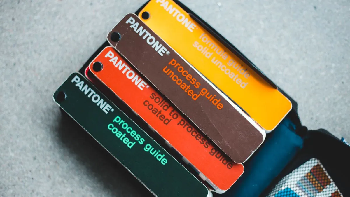
- Your colours as HEX or RGB codes. CMYK and Pantone codes are for print.
- The names of your fonts and the licence that goes with them.
- Examples of photos and illustrations in your style.
- Any icons or patterns you use.
Translating brand colours to the screen
Print colours and screen colours work differently. A colour that looks warm on paper can become garish or dull on a screen. So have your colours checked and adjusted slightly for the web where needed.
Pay particular attention to contrast. Light grey text on white, or white text on light green, is hard for many people to read. The accessibility guidelines (WCAG) require a contrast ratio of at least 4.5 to 1 for normal text. If your brand colour is too light for text, use it for blocks and accents, and choose a darker shade for text and buttons. Read more in an accessible website.
- Choose one main colour for buttons and links, so visitors learn where they can click.
- Use your accent colours sparingly. Too much colour makes a page busy.
- Make sure you have enough neutral colours, such as white, light grey and a dark text colour.
- Consider a dark mode if your audience uses it a lot.
A practical example: an installation company with a bright yellow brand identity. Yellow stands out well on a van, but white text on yellow is hard to read on a screen. The solution is often to use yellow for blocks, lines and icons, and buttons in a dark colour with a yellow border, or the other way round. That way the brand stays recognisable and the site stays readable.
Fonts: attractive and readable on every screen
Fonts are often the trickiest part of a brand identity online. A font you have on your computer can't always be used on a website. For the web you usually need a separate web licence. Check that with the font's maker or seller.
- Use your brand font mainly for headings. For body text, a calm, highly readable font works better.
- Don't load too many variants. Each weight (regular, bold, italic) is an extra file and makes your site slower.
- Choose a text size that is easy to read on mobile, usually at least 16 pixels.
- No web licence? There are often free fonts that look very similar and are free to use.
Logo, imagery and icons on your website
Your logo usually sits top left in your website's header. On a phone there is little room there. A horizontal version or just the symbol often works better. Always use an SVG file: it stays sharp on every screen and is small.
Don't forget the favicon either. That is the small icon in the browser tab and on a phone's home screen. A recognisable symbol or a letter in your brand colour works best there.
Imagery is just as much part of your brand identity. Choose a fixed style for photos, for example light and airy or warm and dark, and stick to it. Tips on choosing and placing images can be found in photos on your website. For icons, use one set with the same line weight and style.
Capturing your brand identity in a design system
A website grows. Pages, blog posts and promotions get added. Without agreements, small differences creep in: a different shade of blue here, a different button size there. A design system prevents that. It is a fixed set of building blocks and style rules for your website: colours, font sizes, buttons, forms and cards.
Write those rules down for other people who work on your website too, such as a copywriter or marketing agency. A short page with your colours, fonts, logo versions and a few examples of right and wrong use is often enough.
In a well-built CMS those rules are already built in. You choose a block, fill in text and a photo, and the branding is automatically right. That way you can update your website yourself without the design falling apart.
Common mistakes with brand identity online
- Copying print colours one-to-one, without checking contrast on a screen.
- Using a decorative font for long texts.
- Placing a logo as a blurry JPG file.
- Giving every page its own style because it adds 'a bit of variety'.
- Using a font without a web licence.
Having Violexa put your brand identity on your website
At Violexa we translate your existing brand identity into a custom website. We check colours for contrast, choose fonts that load quickly and build blocks that keep your branding right on new pages too. A website starts from €1,799 excl. VAT (€2,177 incl. VAT), including design, development, a design that works on every screen, SEO basics, Google Analytics, CMS integration and training.
Not sure whether your brand identity comes across well on your current site? Book a free quickscan. In 30 minutes, online or in person, we look at your website together. Afterwards you get short written advice with a price indication, with no obligation.
Frequently asked questions
Which colour codes do I need for my website?
For a website you use HEX or RGB codes. CMYK and Pantone are meant for print. If you only have print codes, a designer can convert them and check how they look on a screen.
Can I use any font on my website?
No. Many fonts require a separate web licence, even if you have already bought them for print. Check the licence with the maker, or choose a font that is free to use on the web.
Does my website have to look exactly like my printed materials?
No, recognisable matters more than identical. Colours, fonts and logo should match, but on a screen some adjustments are sometimes needed for readability, contrast and speed.