Good app design means people understand what to do without any explanation. They quickly find what they're looking for, never tap the wrong button by accident and are happy to come back. So app design isn't just about colours and a nice logo, but mostly about how the app works in someone's hand.
In this article you'll learn how the app design process works, which rules apply to a small screen, and how a prototype helps you avoid expensive mistakes before a single line of code is written.
UI and UX: two sides of app design
With app design you'll hear two terms. UX stands for user experience: how logical and pleasant the app is to use. Which steps does someone take, where do they get stuck, what do they see first? UI stands for user interface: how the app looks. Colours, fonts, icons and buttons.
An app can look beautiful and still be frustrating, because the steps don't make sense. The other way round, a simple-looking app often works brilliantly. That's why good app design always starts with the UX and only then moves on to the UI. Want to dive deeper into UX? Also read UX design for web applications.
How does the app design process work?
Designing an app usually follows these steps:
- Goal and user: who uses the app, where and for what? A mechanic wearing gloves has different needs from a customer on the sofa.
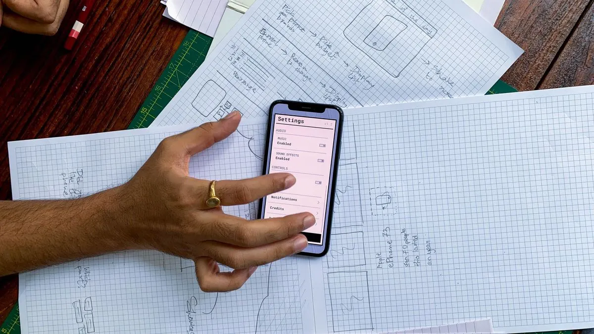
- User flows: writing out the routes through the app. For example: open, search for a product, add to basket, pay.
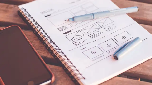
- Wireframes: simple grey sketches of each screen, without colour. This is purely about layout and order.
- Visual design: the wireframes get your brand identity, with colours, typography, icons and photos.
- Clickable prototype: the screens are linked together, so you can tap through the app on a phone as if it were real.
- Testing and refining: a few real users try the prototype. Whatever is unclear, you adjust.
- Handover: the developer gets all the screens, sizes, colours and components to build the app.
Is your idea not quite sharp yet? Then start with developing your app idea. The design goes better once the core features are fixed.
Designing for a small screen: the key rules
An app isn't a shrunken website. People use it with one hand, on the go, often with little attention. That's why it has its own rules:
- Keep important buttons within reach of the thumb, so often at the bottom of the screen.
- Make tap targets big enough. Apple recommends at least 44 by 44 points, Google 48 by 48. Small buttons lead to mis-taps.
- One main action per screen. What should the user mainly do here? Make that the most prominent button.
- Little typing. Use pick lists, smart defaults and the right keyboard, such as numbers for a phone number.
- Clear navigation, for example a bar at the bottom with four or five fixed sections.
- Give instant feedback. Show that something is happening after a tap, such as a loading indicator or confirmation.
- Design good empty screens. What does someone see when there are no orders or messages yet? Explain the next step there.
iPhone and Android: one design or two?
Apple and Google each have their own design guidelines. Apple's are the Human Interface Guidelines; Google's is called Material Design. They differ in details, such as where the back button is, how menus open and what switches look like.
You don't need to design two completely different apps. Usually you create one design with your own brand identity, and follow each platform's habits for the controls. An iPhone user expects to swipe back from the left edge, for example. Going against that makes the app needlessly awkward. If you build with one codebase for both platforms, this also helps when choosing between React Native or Flutter.
Often-forgotten parts of app design
Besides the main screens, there are parts that often only come up late, even though they have a big influence on the first impression:
- App icon: the first thing people see in the App Store and on their home screen. Simple and recognisable works best.
- Onboarding: the first screens after installation. Keep it short, or skip it if the app speaks for itself.
- Permissions: only ask for location, camera or notifications when they're needed, with a short explanation of why.
- Error messages and no internet: what does someone see when something goes wrong?
- Dark mode: many people use their phone in dark mode. An app that stays bright white then looks out of place.
- Accessibility: enough contrast, text that scales with the phone's settings and labels for screen readers.
Accessibility isn't just good practice. Since 28 June 2025 the European Accessibility Act applies, which sets requirements for certain services such as webshops and banking apps. Whether your app falls under it depends on what it does. If in doubt, get legal advice.
Common mistakes when having an app designed
- Jumping straight into pretty screens without first working out the flows and wireframes.
- Packing too many features into the first version, making the app busy and cluttered.
- Only judging the design on a big computer screen instead of a real phone.
- Not testing with real users, only with your own team who already know everything.
- Inventing your own version of familiar components, such as an unusual menu, so people have to search.
- Having the design made separately from the build, so the developer later has to simplify things.
App design and development at Violexa
At Violexa we handle the design and build of your app together. We first create the flows and wireframes, then the visual design in your brand style and a clickable prototype. Only when that's right do we start building. That way you know exactly what you'll get up front. Read more about our approach under websites and apps.
A custom project, including design, development and a design that works on every screen, starts from €1,799 excl. VAT (€2,177 incl. VAT). Larger apps get a fixed price in writing up front.
Want to know what your app could look like? Book a free quickscan. In 30 minutes, online or at your location, we discuss your idea. Afterwards you get short written advice with a price indication, with no obligation.
Frequently asked questions
How much does app design cost?
That depends on the number of screens, how many variants are needed and whether you want a clickable prototype and user testing. At Violexa the design is part of the project, which starts from €1,799 excl. VAT (€2,177 incl. VAT). Larger apps get a fixed price up front.
Which software do you use to design an app?
Most designers work in Figma. It lets you create wireframes, the visual design and a clickable prototype in one place. For first sketches, pen and paper work fine too.
What's the difference between a wireframe and a prototype?
A wireframe is a simple sketch of one screen, without colour, to decide the layout. A prototype links the screens together, so you can tap through them as if the app already exists. A prototype lets you test before anything is built.
Should an app look the same on iPhone and Android?
The brand style can be the same, but the controls are best kept in line with each platform's habits. Think of where the back button is and how menus work. That way the app feels familiar to both groups.